sharing is caring
Here’s the second installment of our popular series of blog posts dedicated to multisensory branding for hotels. Time to open your eyes and pay attention as we take you into the world of visual branding. In today’s highly competitive hospitality market a hotel brand needs to appeal and engage all senses in order to be distinct and successful. To sum it up, your guests need to literally see, hear, feel, taste and smell your hotel brand.
There’s no doubt that vision is the most powerful of our five senses. This makes sense when you consider that around 83% of the information we retain is received visually. However, recent studies reveal that this might only be the case because we are bombarded 24 hours a day with huge quantities of visual information and a lack of other options. There is an opportunity here for all of us, as currently our other senses are not being targeted properly.
How about your hotel brand? Is your hotel visual identity aligned to your distinctive brand message? With our five MAdvices, we invite you to think beyond your own hotel logo and emotionally enhance your hotel brand with the congruent use of all visible elements.

“The question is not what you look at, but what you see.”
Henry David Thoreau
1 – Logo: The logo is the symbol of the entire hotel brand, it's the corporate identity packed in a single sign. As a cornerstone of the visual identity it must of course reflect and embody your stylistic ideas, but above all emotionally touch the defined buyer personas. To find the perfect logo for your hotel brand we recommend taking a closer look at the logos of competitors as well as best practice examples (logos of companies you like and might not even be related to hospitality), in order to not only differentiate the logo from them, but also learn from them.
Take a look at the logo we crafted for our client paloria: based on the cool residence concept for athletes and sporty connoisseurs, the logo takes inspiration from contemporary sport and lifestyle brands. Not only does it emotionally speak to the defined buyer personas, but it also expresses the vision of our cool and stylish clients.
2 – Imagery: “A picture is worth a thousand words.” So make it count! Invest the time and resources needed to create and use distinctive key images/visuals that are clearly connected with your hotel brand. High quality photos are an absolute must for every hotelier to persuade the guest to regularly visit its website or social media feeds. Wait, what about videos? They are getting more and more important on social media and in general as they are a brilliant way to craft your visual branding. An emotionally charged and high-quality hotel video helps your guests to understand your product or service best.
A creative way of establishing a truly distinctive visual language for a hotel you can see with the Kandima Maldives illustration. Be brave and stand out from the crowd and opt for illustrations (or other creative tools) that can help you to build a strong and distinctive visual language.
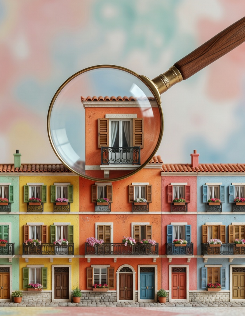
3 – Design language: Distinctive design generates distinctive brands, and successful brands are by their very nature visually “smashable”. If you are planning to design a new hotel, then we invite you to consider how your building can become unique in its form, architecture, style and design. The Marina Bay Sands in Singapore or the Burj al Arab in Dubai show the power of unmistakable design in the hotel industry. The sail-shaped design and its exposed location of the Burj al Arab make the building is unmistakable. Or think at our loved Baros Maldives - the overwater fine dining restaurant, The Lighthouse, is so unique in its structure that it is unmistakably connected to this resort. And of course, is featured on most of its key visuals.
Besides considering the uniqueness of your architecture we also suggest to select a recurring form within your hotel, such as those used in the furniture or design. If you want your hotel to be perceived as sympathetic, friendly and modern, then square forms make an excellent visual shape choice for communication materials (square business cards, brochure, writing pad, etc.). Why is it important to select a brand shape? Shape is an instantly recognisable visual aspect of any brand. Statistics show that e.g. 40% of all perfume purchase decisions are based on the design of the bottle.
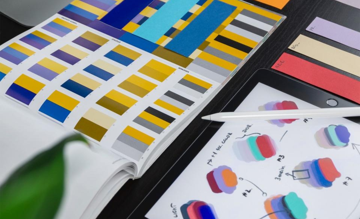
4 – Colour: Define your colour/s and use them consistently in your communication and throughout your website and social media channels. In addition to pictures, colour has the highest recognition value and thus can be used as exclusive brand mark. We all know that there is also a psychological association to each colour, that e.g. green stands for eco-friendly and freshness, blue conveys trust and purple is often associated with creativity and luxury. A little off topic, but Viagra – Pfizer has successfully taken advantage of the visual component and has given their pill not only a distinctive blue colour but also a unique diamond shape!
How can you decide on what colours you need for your hotel brand? It’s simple really. Just base it on your hotel concept and positioning. A brand such as Kandima Maldives might use a wide and playful colour palette, while Haritha Villas + Spa gives space to its contemporary architecture and lush surroundings and works with white and black as their main “colours” with green colour accents reflecting its natural location.
5 – Font: Fonts matter - and not just to graphic designers! All your defined signature fonts are seen by your guests (hopefully) everywhere: on your website, communication materials, etc. Therefore, the font you choose for your hotel is a valuable tool to express your brand personality and to evoke additional associations and emotions. Distinctive typography helps you to enhance your hotel brand character and conveys your tone. Have e.g. a look at the website of citizenM and the one of Edition Hotels: both of the brands have chosen a font perfectly matching their brand personality. Just imagine how strange it would look if you would switch the fonts between the two websites. Remember, guests learn a lot about your hotel brand based on the font you choose.
Consistency is key. Apply the same distinctive imagery, the same colour, the same design language, the same font type across your visual platforms - at all times. It creates cohesion, so that your guests always get the same story across all channels.
As always, we look forward to hearing from you. Feel free to comment below as well as to share this blog post.
Thank you and all the best for WOW-ing your guests via your distinctive visual identity,
Your MA people
 ke time for prosecco ke it happenke it meaningfulke good coffeeke it matterke funny jokeske it kindke it simpleke it count
Sign up for the MAp newsletter for practical insights on hotel branding, marketing, and sustainability, plus fresh thinking from our projects and new tools from our sustainability platform. Let’s move #onwards together.