sharing is caring
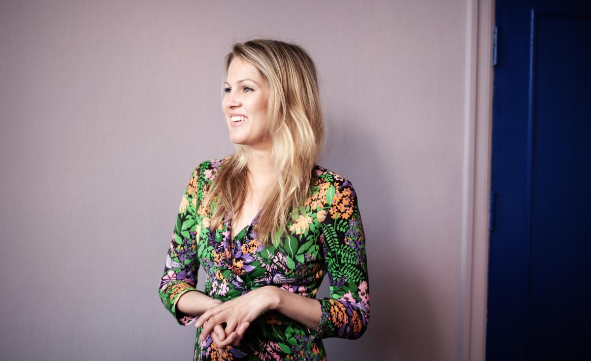
Today we are more than excited to meet Dagny Thurmann-Moe – Creative Executive, Colour Designer and Consultant of Koi Farge Studio, Oslo. Dagny is one of Norway’s foremost colour designers and in 2014, she has started the Koi Colour Studio with the goal of being able to offer targeted colour consultation for both public and private clients.
Dear Dagny, thank you so much for taking the time for this MA people meets. To begin with: when and how have you discovered your love for colours? And how did a profession develop out of this passion?
We could reverse the question; When did you stop loving colours? The fact is, we’re all born with a strong relationship with colours. If you talk to any child under the age of 10, they will give you vivid explanations of each colour and they have a complex understanding of their effect on us. I gues what happened with me, was that I never stopped. The interest just grew, and from the age of 16 I started reading every book, research and study I could get my hands on. I was interested in a wide perspective – how we used colours in different aspects of our lives; interiors, architecture, institutions, the car park and clothes. What feelings and associations did we have with different types of colours and why? How did they affect our wellbeing? I started studying something completely different at the University of Oslo, as colours were not an option, I ended up choosing pedagogy, sociology and informatics. My first career was in recruitment and business management. It lasted for 10 years. In 2007 I started a blog about Scandinavian style from a maximalistic perspective, and colour was an important part of it. Because of that blog, I was headhunted for the role as Creative Director for a Norwegian paint/home improvement retail chain, where I worked on developing interior and exterior paint colours and collections, colour forecasting, inspiration images and folders. After 4 years there, I started my own colour studio – where we work on developing colour concepts, palettes and strategies for architecture, interiors and products.

In 2017 you have published the book “Colour to the People!”. Can you please share with our readers why we should all use colour in a more targeted way?
I often say that only shallow people disregard the value of aesthetics. How our surroundings affect our daily lives have more or less been ignored for decades, and with my book, I wanted to visualize and explain why it is so important to have the end users in mind when we develop spaces – and that colour is a factor that cannot be ignored, just like other factors like daylight, greenery and materials. I also photoshopped colours onto contemporary architecture, which had a great effect on the readers.
Many of our readers are hoteliers, working in hospitality businesses: HOW can they bring more colour into the hotel?
How is the right question, but the answer is that it depends on your target customers, location and identity. The biggest challenge with hospitality at the moment is “same shit, same wrapping”. Don’t leave colour and material choices to choice by accident, but have a plan in what you want to communicate, what type of feeling the spaces should give and don’t be afraid to make some decisions that are outside of your comfort zone. A good use of colour is not necessarily lots of colours. It depends on the clientele.
How would you describe the hotel landscape in Norway, did any recent hotel developments catch your attention?
We have the “same shit, same wrapping” situation here as well. There’s not really anything that I haven’t seen before. I’m excited to see how Sommero Hotel will turn out when it opens.
We at MA people are specialised in crafting innovative hotel concepts and brands: what makes a hotel experience a truly outstanding one for you personally?
A strong and confident concept, that can be an experience in itself with great food and excellent service is what matters to me the most, and will make me a loyal customer and ambassador. I also appreciate it when the décor can be a mix of old and new. When everything is new, it gives the spaces kind of a catalogue feel, which I find a bit uninteresting.
About Dagny:
Dagny is one of Norway’s foremost colour designers and has over ten years of experience in the field. In 2014, she started Koi Colour Studio (formerly Dagny Colour Studio), with the goal of being able to offer tar- geted colour consultation for both public and private clients. Dag- ny is a driving force for increasing awareness about the targeted use of colour, and in 2017 she published the book Farger til folket! (Co- lour to the People!) with Cappelen Damm, a book about why and how we should use colour in a more tar- geted way in architecture, interi- ors, public spaces, fashion and car parks. The book is published in four countries. She is a well-known face in the media and often comments on colour use, trends and the value of the proper use of colour in archi- tecture, interiors and fashion.
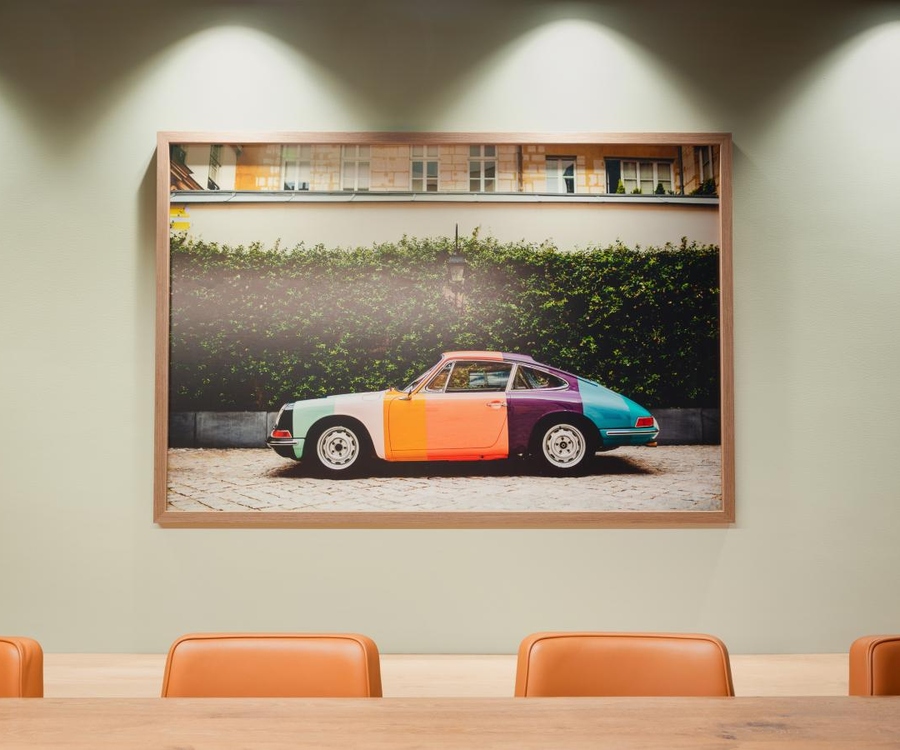
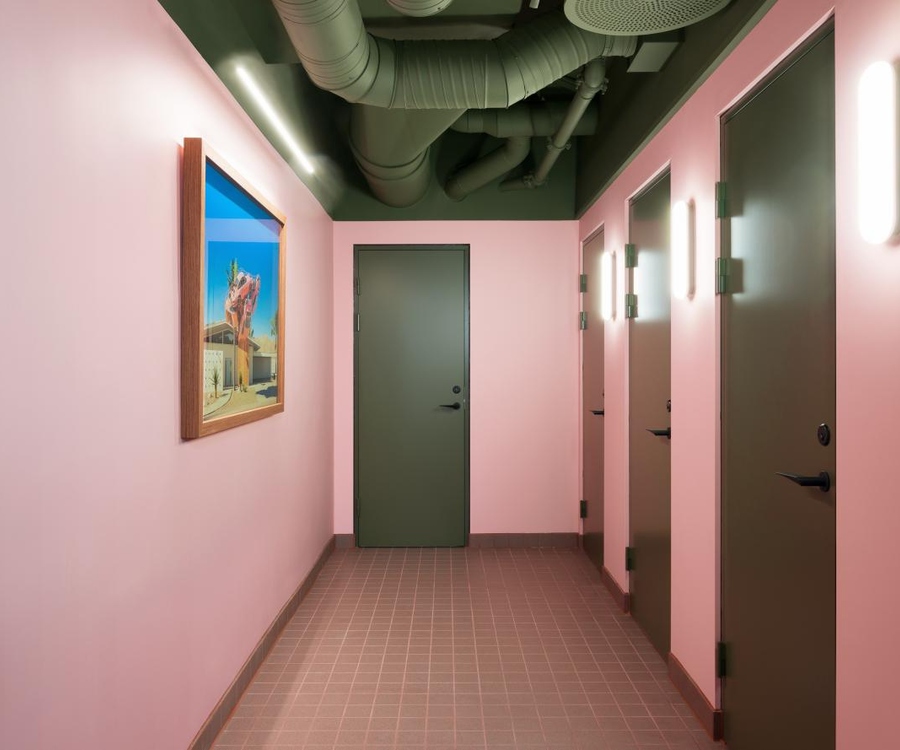
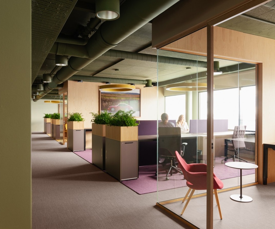
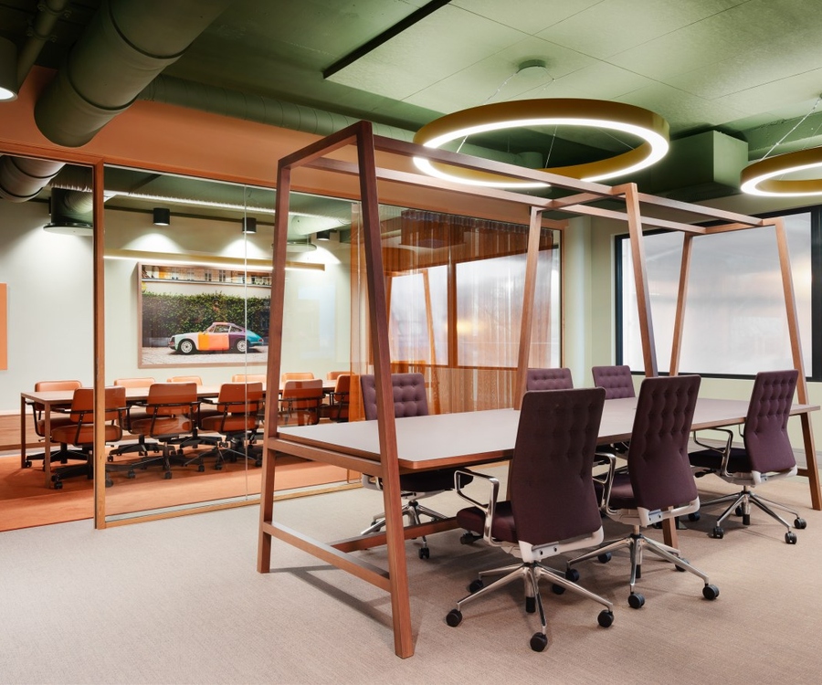
Photos 1 to 4: Porsche Norway’s head offices
Colour design: KOI colour studio, Interior architect: Kubik interiørarkitekter, Photographer: Einar Aslaksen
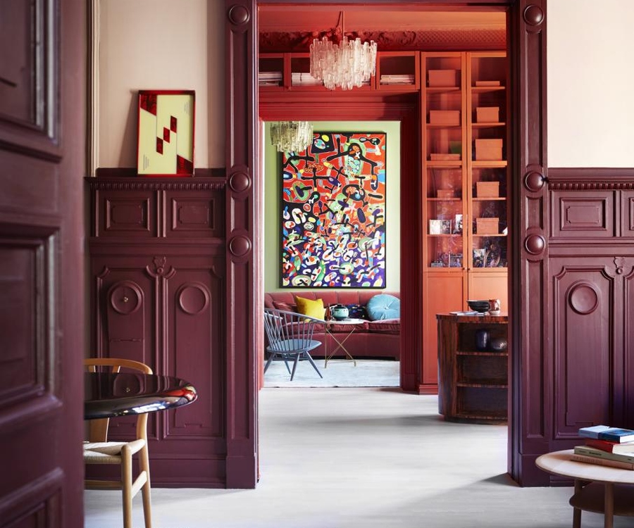
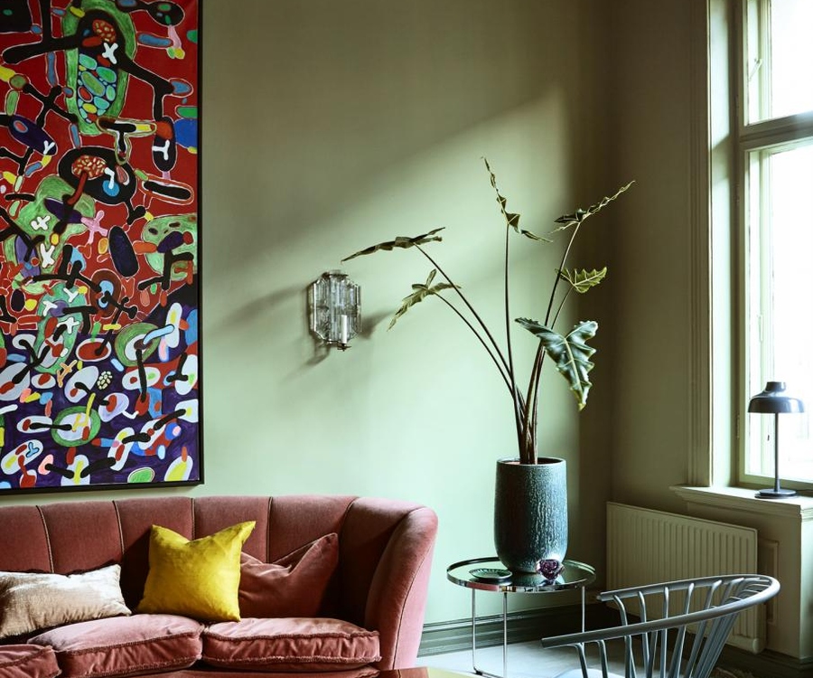
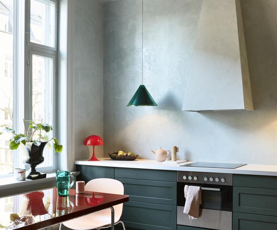
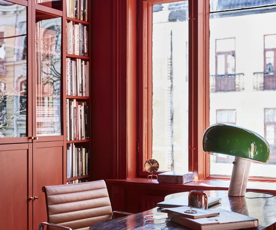
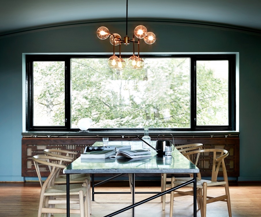
Photos 5 to 8: Oslo 1840s apartment
Colour design: KOI colour studio, Photographer: Margaret de Lange, Stylist: Kirsten Visdal, Client: Pure&Original paint
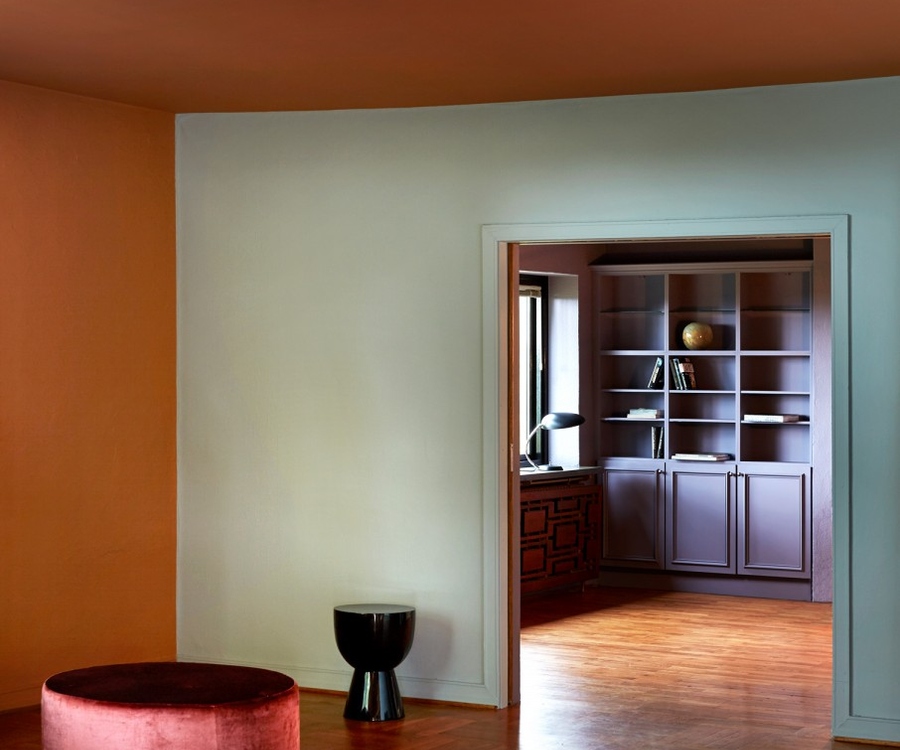
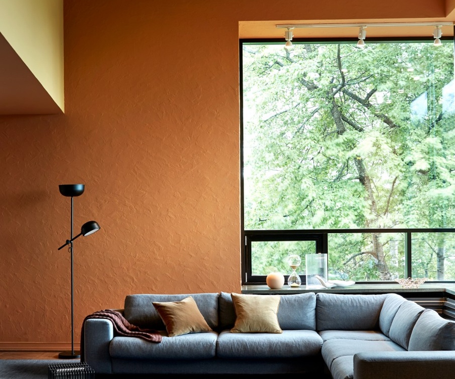
Photos 9 to 11: Oslo 1930s modernist villa
Colour design: KOI colour studio, Photographer: Margaret de Lange, Stylist: Kirsten Visdal, Client: Pure&Original paint

 ke time for prosecco ke it happenke it meaningfulke good coffeeke it matterke funny jokeske it kindke it simpleke it count
Sign up for the MAp newsletter for practical insights on hotel branding, marketing, and sustainability, plus fresh thinking from our projects and new tools from our sustainability platform. Let’s move #onwards together.